Friday, November 17, 2006

Why isn't Flushed Away doing better at the Box Office?

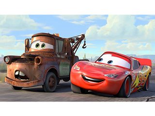
If you're anything like me, you probably were not very interested in seeing Aardman/Dreamworks' new film, Flushed Away. I was told by a friend how amazing it was and decided to see for myself. I was extremely impressed by the film, which is 99% Aardman and 1% Dreamworks. The animation, the character design, the timing and comedy and writing - it's all top notch. I might even go as far as saying that it is the best animated film this year. (Even better than Cars, in my opinion.)

So why is Flushed Away doing so badly in theaters right now? So far it has only made about $40 million, a huge loss for Dreamworks in comparison to hits like Shrek and Madagascar. Well here begins my explanation of the problems with Flushed Away. First, watch the trailer below:


1. The trailer for Flushed Away is for a different film. What you see above is Roddy (the main rat guy) with two hamster servants - characters that were eventually cut at a very late time in production. They were a bad idea to begin with and to feature them throughout a whole trailer was an even worse idea. They also decided to show the ONE pop-culture joke in the film (the Finding Nemo one) - there are much stronger jokes in the movie than that.

2. They chose to show the most boring parts of the film in the trailer. The short amount of time Roddy spends in his human house is by far the least interesting, and features the most annoying secondary character, Sid. On a side note, they also showed the least visually interesting parts of the film. Inside the sewer-city is rich and detailed and beautifully designed - the indoor-house stuff barely looks like it's textured at all.

3. What is this film about? Not once did we see the evil toad character or get ANY sort of idea what the real story is about. All we see is a snotty mouse being flushed down a toilet. They didn't even show the french ninja frogs!

4. They made a movie about talking animals. As we all know, this was the year for movies about sarcastic little animals and their battles with humans encroaching on their land, etc. Over the Hedge (another Dreamworks film), The Wild, Ice Age 2, Barnyard, Ant Bully, Open Season (and I suppose we could include Madagascar and Chicken Little in there too). WE GET IT. ANIMALS ARE CUTE AND FUNNY. Let's try something original for a change. Flushed Away is thankfully different from all those other films - it is not sarcastic or crude; it is slapstick at its best with the same sort of humor you find in the Wallace and Gromit films, but a little more appealing to Americans I think.

5. Overall nasty marketing. Whoever turned this goldmine into a dud should be fired. The trailer I posted above is an early one, which shows you the trouble they had with the script. (I heard there were over 100 versions of it at one point - perhaps that's why it cost $149 million? Either that or it was made on golden computers.) I say "nasty" marketing because many of the recent ads I've seen feel like dirty political ads. They have comments on them that say things like "Funnier than CARS!" or "Better than ICE AGE!" Seriously, people. Do you need to put down other films to make yours appealing? Those films aren't even in theaters now! It's not like they are competing with each other. Just show why your film is good instead of claiming its "better than other things".


So why should you go see Flushed Away? Because it's hilarious and a good time for everyone. I was probably cracking up more than the kids in the movie theater...but that's nothing new.

Monday, November 13, 2006

Wise Words from Brad Bird

Just caught this in a NY Times article about "How to Be Funny."


How to Draw Funny Pictures By Brad Bird, creator of “The Incredibles”

Because animation is a relatively complicated process, and because it is not spontaneous, it is often mischaracterized as purely mechanical. In reality, and at its best, the art of character animation exists somewhere between silent comedy and dance. Its success depends on finding a physical expression that is recognizable yet beyond what occurs in real life.

Fred Astaire had unusually large hands and learned how to use them in a way that made his dance more dynamic; he’d fold his hands for most of a routine, then flash them out for accents at key points. Their sudden increase in size made those moves pop in a way that other dancers couldn’t match. Animators use tricks like this all the time in ways that the audience never sees but always feels. Bugs Bunny, imitating the conductor Leopold Stokowski in concert, will violently raise his arms in onetwelfth of a second (two frames of film). Every part of his body will be rock-still — save for Bugs’s quivering hand.

It is impossible for a living being to do this, but not for Bugs. He is truly Stokowski, more Stokowski than Stokowski was himself, because Bugs is the impression of Stokowski: his power, his arrogance, his supreme control over his musicians, perfectly boiled down to its essence. We laugh because it is completely unreal and utterly truthful in the same moment.


As I read on, I noticed this all-too-true tidbit from writer Patton Oswalt:

"Lately I’ve been doing punch-up on computer-animated films, but the trick with doing punch-up on these movies is that unlike the live-action script, which hasn’t been filmed yet, the computer-animated film is usually 80 percent complete by the time we see it. And when I say 80 percent complete, I mean, “We’ve spent $120 million on this, so we really can’t change anything.”

“Uh, well then,” you’ll ask, through a mouthful of takeout Chinese, “what exactly do you want us to do?”

“What we need is for you guys to come up with funny off-screen voices yelling funny things over the unfunny action.”

I didn’t know you could make comedies that way! This is comforting news. Can I take old super-8 footage of a kid’s birthday party, where none of the other kids showed up? And he’s sitting at the kitchen table, and he’s got his little birthday hat on, and a lonely little cake, and he’s crying, and just when you’re about to kill yourself from the pathos, someone offscreen yells:

“I just fell on my fanny in some butterscotch!”

Wow, you’ll think, suddenly cheerful. Someone I can’t see, or will ever see, just fell into some butterscotch and is now talking about it out loud the way no one does or has, ever!

Did I mention there’s lunch? "


Tuesday, October 24, 2006

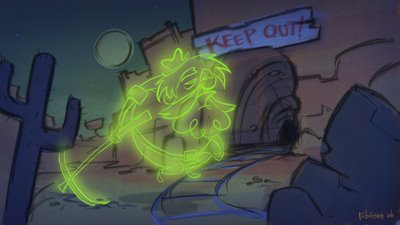
Illustration Friday: Ghost


I was inspired by Scooby Doo on this one. :]

Sunday, October 01, 2006

An Evening with Syd Mead

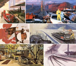
For those of you who are unfamiliar with the name, Syd Mead is a futurist and concept designer whose work has appeared in films like Bladerunner, Aliens, and Tron to name just a few. Last week he was in Rochester for a presentation at RIT. I made the trek out for the evening and was glad that I did. Though Mead is now entering his 70's, the man is still very active in the industry today and has a lot of useful stories and bits of information to share. What I was truly amazed by was his futurist concepts that he did while he was working at Ford in the 1950's. Somehow he was able to sit around all day creating these wild concepts for vehicles far in the future...I have a feeling that today that position no longer exists. (And not just because Ford is slowly going down the tubes.) Some of Mead's designs from 50 years ago have become a reality; notably one that functioned much like a Segway. Not that any normal person really uses a Segway. (Which makes me wonder how willing people will be to adapt to new modes of transportation.)


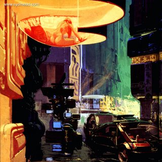
Mead discussed some of his work on Bladerunner, which really sounds like a great project to have worked on. Though it was hampered by budget constraints and Ridley Scott being fired at one point in production, it remains as a high point in sci-fi movie history. You know how sometimes you'll look at sci-fi concepts and not really understand what half the stuff is? Well Mead revealed that that is just part of the job. He will often throw some shapes together that have just the bare elements of a recognizable setting or object, but with plenty of extra features and dials and shapes to create a futuristic feeling. He showed one concept from Bladerunner of a bathroom in the future. You could tell that it was a bathroom because of the sink and the toilet-like device, (as well as the size of the room) but beyond that you'd be hard pressed to find anything else you'd recognize from a bathroom of today.

He also pointed out another concept (this one from a videogame) that had the classic ultra-detailed overly complex sci-fi look to it. He explained that in the future things would obviously be simpler and many tasks will be accomplished unseen (nanotechnology I assume), but for films and games people expect to see circuitry and pipes and wires and all that schmutz all over the place. To some degree I appreciate that classic look of "run-down and dirty sci-fi future," but at the same time I think it has been overdone and doesn't really reflect the way the future will probably be. (Whose to say, but as I mentioned before, there will probably be nanorobots that clean the streets and hopefully pollution will be eliminated.)


The only problem I found with Mead's work is that it still looks the same today as it did in the 1950's. His vision of the future has not developed as rapidly as technology has developed, but his rendering skills still blow me away. Mead recently released a series of DVD's with the Gnomon workshop, as well as publishing a few books from his own publishing company. I picked up the latest one, "Sentury," and got it signed by him. (Oh and I yanked these works from the net, thanks to whoever posted them.)

Wednesday, September 27, 2006

Ottawa Animation Festival 2006: A Report

I have returned from the far away lands of the North! After three long days of animation, animators, recruiters, friends, professors, and pumpkins I can finally sit down at the computer and report on the experience. Complete with pictures.

Hooray Ottawa!! (This is by one of those Pratt guys...pretty sweet!)

I began my Ottawa experience this year by leaving Rochester at 5 AM and making it all the way up the city by 10:30 or so. After getting a little lost I finally found a place to park (note to self: parking the National Arts Center is mucho expensivo.) Once there I wandered over to the Jonathan Hodgson workshop. Hodgson is an animator that I had never heard of by name, but I immediately recognized his style when he showed his commercial work. His website has a lot of his work, go check it out. He mostly talked about how he developed as an artist and even showed a chronological slideshow of his work starting at age 6. Hodgson explained that he is very easily influenced by other artists and always had a hard time finding his own style. I think most of us can relate to that. Now I find myself being influenced by him...some of his work reminds me a lot of Dave McKean, but in a less eerie way.
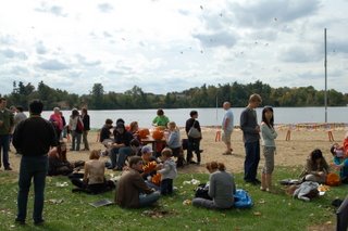
PICNIC TIME!

After Hodgson's workshop I waited an hour for the bus to take me and a whole bunch of other animators over to Mooney's Bay for the annual Ottawa Picnic. Though it was my third year at Ottawa, it was my first at the picnic. It was a little awkward and overwhelming, but the food was great (annnnnd free booze) and I ended up meeting a lot of interesting people. I caught up with Lorelei Pepi, a friend and former professor from RIT. I'm still working on her new short, Happy & Gay, which will hopefully be seen at Ottawa next year. She introduced me to some great indie animators, including George Griffin, Karen Aqua, and Fran Krause among others. While at the picnic I spotted Ward, of Ward-o-Matic fame, and John (Robotjohnny) who were both at the fest under the guise of MEDIA for Drawn!. I also got to meet Amid Amidi and Jerry Beck of Cartoonbrew and some cool kids from Pratt who are interning at Frederator.

Part of the Ottawa picnic tradition is a pumpkin carving contest, with lots of interesting entries...though I'm not sure who won.

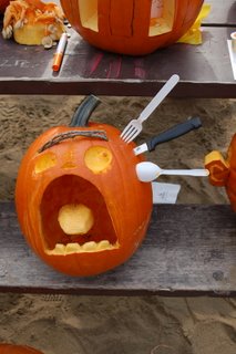
Might be my favorite.

After the picnic I was able to check in to my hotel, which was oddly named "ARC The Hotel" but had a great location just a block away from the NAC, the main screening location for the fest. The hotel was pretty fancy (they offered me a glass of champagne and Belgian chocolate when I checked in) and was able to hold all 5 of us kids staying there. Speaking of which, I was staying with some friends from RIT, Sean Keeton and Bob Rutan, as well as their respective lady friends, Pana and Gina. (I ended up on an air mattress in the corner.) Unfortunately Sean had some car trouble and ended up making it to Ottawa a bit after midnight. In the meantime I was taking in the "ToonTown" retrospective of animation made in Ottawa over the last 65 years. There was some amazing work, including Norman McClaren (there's that new DVD box set out if you're looking to buy me a present) and the world premiere of Nick Cross's Waif of Persephone. Cross's film was beautifully designed and animated (verrry Spumco of course) and had a quirky storytelling sense.
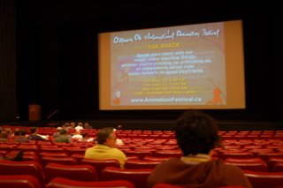
Those NAC chairs are actually not too uncomfortable.

After the Ottawa retrospective I stayed for Short Competition 3, which featured a film by my old RIT professor Skip Battaglia. Skip's film, Crossing the Stream, is described in the fest guide as "A poem in the shape of a stream," which is very well said. It was one of the very few experimental films that I could not only sit through, but appreciate on an artistic and cinematic level. Other shorts that stood out to me were Tyger from Brazil, and Run Wrake's Rabbit. Rabbit's style was a mix of 1950's Dick & Jane illustrations and Adult Swim-ish After Effects animation. It work surprisingly well together and had a crazy story to go along with it. After the screening I found another RIT prof and stop-motion animator extraordinaire, Tom Gasek, and a bunch of us headed over to Chez Ani for a drink.

Saturday brought a lot of stress early in the morning. This was the day of Ottawa's new feature, "Animators for Hire." It was arranged around six different companies (Disney, Blue Sky, Nerd Corps, Mainframe, Studio B, and Longtail). There were six tables and each table had 6 or 7 people at it with portfolio and reel in hand. We were given 14 minutes at each table and then the entire group would shift down to the next table. (Clean cup clean cup! That's how it felt, really.) The people from each company were pretty friendly, but I have to say that Disney was surprisingly the most helpful and genuinely interested in giving feedback and taking note of the different people who came by. When I have seen Disney at past fests, as well as at Siggraph the past couple years, they came across as very corporate and scary. They would not look at people's portfolios (legal reasons), and this year they would not accept reels at Siggraph. (There is a new online submission thing, which really works best in the long run.) Anyway, I was happy to talk to them as well as all the other companies there. I also met a lot of interesting animators from Canada (as well as Dubai and Brazil) along the way. Mainframe has a feature coming up and Studio B looks like they are almost overflowing with 2D work for you flash guys and gals.

After a couple hours of selling myself I gladly settled in for the Bruno Bozzetto Short Films screening. Though I had seen many of the films before they were just as funny, if not funnier, than I remembered. Bozzetto himself was there to answer questions afterwards which was a real treat. I wish I had been there for the screening of Allegro Non Tropo earlier in the week.

I grabbed a quick lunch at the conveniently located mall cafeteria and headed down to the Arts Court for the "LAIKA: How We Do It" workshop. I found a seat next to Ward and the place quickly filled up and spilled out into the hallway next door. There were a couple directors from LAIKA's commercial division and the moderator was Tom Knott, an animation veteran and LAIKA recruiter guy of sorts. We saw some interesting glimpses into the process of creating a TV spot, and they left us wanting more. Though we did get some innapropriate t-shirts:
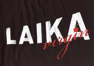
The back says, "Animated for the very first time." HAR HAR HAR!

(I dunno if I'll be wearing that any time soon...) When I got back to the NAC I tried to get into the Bob Clampett thing that John K. was doing but it was full. I did make it to the main Bob Clampett retrospective. Seeing those films in beautiful 35 mm prints was so great. They played most of my favorites, including Gruesome Twosome, Baby Bottleneck, Book Review, and Great Piggybank Robbery, as well as Coal Black and de Sebben Dwarfs, which I was surprised and pleased to see got a public screening after all these years. (Regardless of content it is an amazing piece of work!)

After Bob Clampett was Short Competition 5, which had some great films in it. Mr. Scwartz, Mr. Hazen & Mr. Horlocker was very entertaining and picked up a big award later on. It was a non-linear story involving three different guys in an apartment building. We first see one story happen, then the film stops and rewinds itself and we see the same story from a different perspective, which explains things and is very funny. This screening also featured Le Building, which is always a good watch, as well as Carival of the Animals which received an Honorable Mention at the fest. (Though it was very sexual it was also very playful...but a bit too long for my taste.) Then there was an anti-smoking ad with two cute dolls that are about to kiss, when suddenly their cat pukes on the floor. The guy doll stops and picks up the puke and eats it, then leans in to kiss the girl. I guess kissing a smoker is just like that? I wouldn't know, none of my girlfriends have been smokers. (Though some might have eaten cat vomit?)

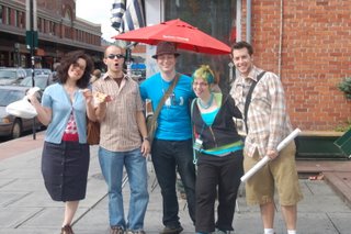
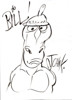
The Saturday night party at Barrymore's was a ruhl good time. I met John K! As well as got a fantastic picture of Mr. Horse with a rubber nipple on his head:
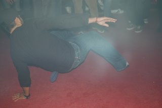
I have also learned that animators like to dance and drink. A lot.

Ward and John are saying, "Oh man this wierdo is gonna take our picture and put it on his blog!" (Don't worry...I won't.)

Here's Sean (not me) and John K. I didn't want to interrupt John K's time with the ladies that were hanging all around him. (Animation celebrities are a wierd idea.)

Sunday was a bit more laid back. I hiked down to the Bytowne for Short Competition 4...which felt very long. Backyard Shadow was a short that featured time lapse photography of shadows of treebranches moving across a house. It was edited very well to some intense music. Fertilizer Soup, a short from Gobelins was beautiful and fun as I have come to expect from that school. Taste of Life featured a very promising concept (a masseuse who tenderized people and then baked them in the sauna and ate them for dinner) but was very repetitive and waaaay too long. (11 minutes) And then there was Conte de Quartier, which was animated mostly in oil paint...an amazing feat but you can only watch that style for so long. And 15 minutes is too long. Wayyyyy too long when you're at the end of a 2 hour block.

After a decent lunch at the Elephant and Castle (don't order the Curry, it's not what you expect) we saw our last screening, which was the International Showcase. I was happy to finally see Dreamworks' First Flight, which was one of the best pieces of animation I have seen come out of that studio. It was a cliche and almost obnoxious story (about a hyper-cute baby bluebird who needs to learn how to fly and a stuffy businessman who teaches him how and learns about himself at the same time, etc etc) BUT, it had a lot of heart. And I cared about the characters and it kept my attention. (Which is more than I can say for 75% of the films I saw at the fest.) Next was Disney's Little Match Girl. I just don't know. It was beautifully animated...but something went wrong here. I saw Hans Bacher's designs for this short and they were amazing. The short kinda sputters and dies. (Like the matchgirl herself, haha. I'm awful.) It's an okay film but I feel like Disney could have been a little more adventurous. It was so driven by the music that I imagined it as part of Fantasia or something...and it would have been the low point of a film like that. But the worst was yet to come. There was this film from Austria called Salome in Low Land. It was an 8-bit opera of sorts...a very heady and complicated story told in song and displayed in video-game style graphics. That sounds kinda cool doesn't it? It wasn't. It was a whopping 10:24 and I pretty much wanted to die throughout the whole thing. Someone actually stood up in the middle of it and shouted, "THIS FILM IS SHIT!" and then stormed out of the theatre. Okay, so by someone I mean me. (Just kidding. But that really did happen.)

This is a Beavertail. It looks really disgusting here, but it's probably the most delicious thing ever. Basically it's friend dough with maple butter all over it. I could eat ten right now.


And then I drove the six hours back to Buffalo! Overall it was a great break from work and I mostly enjoyed catching up with old friends and meeting new ones. Though I have my doubts about the taste of the screening committee (ie Chris Robinson's taste) I still look forward to next year's fest. (Boy this post took forever to type. And I use parentheses too often.) I leave you with some pics:

It was so tempting.

Sean & Pana and Gina & Bob!

I love this picture because we look pretty cracked out. And when did Gina become an amputee?


See all my pics from the fest up on Flickr.

Monday, September 18, 2006

Ottawa Here I Come!

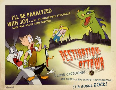
The pic you see above was my entry for the Ottawa Animation Festival contest that Cartoon Brew held a few weeks ago. It won me a free pass to the fest! Huzzah! As you can tell I am pumped for the Bob Clampett retrospective. I think I will try to see it on Friday morning if I can make it into town early enough. Last year I was a little dissapointed with the overall quality of films I saw compared to the year before that...but this year looks to be chock full of entertaining stuff! Cartoonbrew has a whole lot more info, as well as the official site for the fest. So get 'yo butt to Canada this weekend!

Monday, August 28, 2006

Thesis & Website Update!


So the massive overhaul of my website is finally done. It was actually finished around Siggraph, but I thought it deserved some mention here on my blog. Not only is there all new art (character design, layout, life drawing, etc), there are two demo reels (animation and concept design) and my finished thesis, "Love at First Roach," is available to download. (Just go to the animation page and choose your format.) The address is www.liamrobinson.com (or just click on either of the images.) Enjoy!

Thursday, August 17, 2006

Illustration Friday: Play


This little dog here is in honor of my sister's new pup, Sam. I had fun playing with her when I was out in Boston a couple weeks ago. Wish I had more time for Illustration Friday...but I've got a couple other big projects going on right now. Unfortunately I can't post them to the blog. Hopefully some day I will be able to! :D

Saturday, July 22, 2006

Concept Art: Skull Cave


Ehhh....needs work.

Illustration Friday: Opposites


Fairy tales have some great opposites, especially Hansel and Gretel. (Probably my favorite story.) This is actually the second version of this piece. I got some help with the composition from Simon and I think it's turned out much better. Also, I'm heading to Siggraph next week in Boston! Hooray! I'm excited to have a mini vacation and meet up with some old freinds. Any other artists heading out there?
Friday, July 21, 2006

Concept: Circus


Circuses are fun...right? MAR HAR HAR

Wednesday, July 19, 2006

Concept Art: Market

I like concept art. In fact, I'd love to be a concept artist someday. I did this piece after getting some pointers from the amazing Simon Rodgers. Thanks Simon!

Wednesday, July 05, 2006

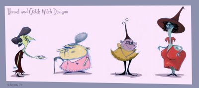
Hansel and Gretel Witches


Here's something that will be up on my new website in the character design section. Thought I would share it here too. Who knows, maybe someday I will animate one of these lovely ladies...

Thursday, June 29, 2006

Illustration Friday: Rain


Wooo! First post in a loooong time. And it's appropriate because upstate New York is being drenched right now. (Though I made the IF deadline by an hour...so if anyone sees this, that's great.) Also, would you believe this piece is completely digital? And done in software that only costs $20? Well it's true! It's called ArtRage. They have a free version too!! All you illustrators should check it out riiiiight now.

And for anyone else who cares, I graduated college and I am now working at Fisher-Price as an animator! Wahoo!! Though the job is only til February, so I will be looking for something in a few months. (Anyone out there from Laika want to give me a call? Yeah? Okay, cool.) Oh and my new website will seriously be up soon. I want to get it done before Siggraph in August...so...yeah. Look for that too.

Wednesday, April 19, 2006

Ezra's Epitaph Coming Soon


I made this postcard for Ian's movie. Ezra's Epitaph will premiere at Bard College on May 6th at 7 PM in Avery. I can't wait!

Saturday, April 01, 2006

Rendering!

Here's a teaser of what's to come in 7 weeks...

Sunday, February 26, 2006

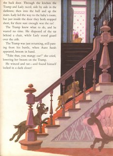
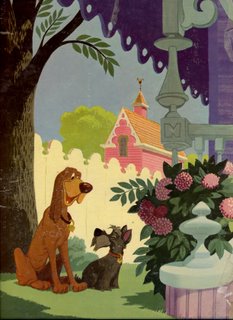
Lady and the Tramp Storybook

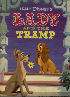
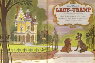
To celebrate the release the new Platinum Edition (or is it 50th Anniversary Edition?) of Disney's "Lady and the Tramp" I've decided to scan in and upload some beautiful illustrations from a Tramp storybook I've had lying around. I picked the book up for 50 cents at a tag sale, which was still a good deal for a first edition (1955) regardless of the fact that it's falling apart. The art is spotty in the book - some illustrations are completely off model and uninspired while others are obviously by talented artists. (I only included the best ones.) Look at the way the rain scenes are rendered! Very nice. The cheap Disney storybooks released nowadays make me die inside. (Also, this book is long out of print and nobody's making any money off these pictures...please don't sue me for posting these.)


(front cover)


(back cover)


I also have a first edition Bambi storybook that has some amazing art in it...maybe I'll get around to posting that some day.

Monday, February 20, 2006

Illustration Friday: Song


ROCK! \oo/

Friday, February 10, 2006

Saturday, January 21, 2006

Illustration Friday: Cats


Did this one early on in the school year. I was gonna make a series of 6 paintings in this style...but then I had to make a thesis. So it's been postponed. Cats! (That's totally gonna be my mom in a few years...)

Bill Peet's CARS

So I'm surfing around Bill Peet's website and I find these old designs for the Disney short, "Susie the Little Blue Coupe." I've yet to see the short, but these designs look uncannily like Pixar's character designs for CARS. See for yourself:


Bill Peet's car designs

Pixar's car designs


I duno. I guess there's only so many ways to design cars, but I feel like Bill Peet must have had a pretty strong influence...wouldn't be surprised if they had pulled some of his drawings from that handy Disney archive. Visit Bill Peet's site for more pictures from "Susie."

Friday, January 13, 2006

Illustration Friday: E is for...


Enlisted officers coming to your college campus and tryign to get you to sign up for the army! Heh. So yeah, this was for my college mag, Reporter. But that topic's so wide open that I guess it works.

Wednesday, January 04, 2006

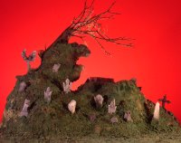
Ezra's Epitaph Graveyard Set

Yesterday Ian and I created a miniature set for his senior thesis, Ezra's Epitaph. It's a really cool graveyard with a coffin and a tree on the top of the hill. We made it surprisingly fast...in about 6 hours. I'm working on some CG stuff for his film as well, so I will post that at some point.


The Set! There are live action people composited over certain sections of this...as well as stop- motion animation.


Here is the back of the set...you can see that we started with balled up newspaper which we covered in masking tape to hold it down. Then we used plaster cloth and green floral foam to create the terrain. We crumbled up the foam to make the grass, as well as added some tufts of fake fur painted green for long grass.


I was going for "scared" and I don't know what Ian was doing.


P.S. This movie's going to be awesome. Coming Spring 2006 to a Bard College campus near you!