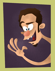
Here we have the scary neighbor Steve Buscemi character:

I actually think this might be the most succesful of the three characters they show. Though they do miss out on the exagerration of the mouth in the second two images...and check out the eyes in the middle one! He's much more menacing when we see more of the whites of his eyes. (Also, this drawing is the image they chose as the cover to this little booklet - NOT the CG version.)

Above is the boring girl character. They took some decent (yet rather subtle) expressions and toned them down until she looks like a zombie. She was definitely the one character in the film that I wished had more life to her. Again, check out the eyes - the same problem that plagued the Polar Express. (Ward Jenkins had a great post where he went back and fixed some of the frames from that film in Photoshop. What a difference! Are you listening, Zemeckis/Disney?)

And here is the token obnoxious friend, possibly the worst of the three. Though it does look like something went to the bathroom on his head, at least he doesn't look evil.
I'll be honest, I really liked Monster House for what it was. I would have loved to see it fully animated rather than Mo-Cap, but that wasn't my call. It's definitely a step in the right direction from Polar Express, but let's hope they keep refining and improving those expressions! Now, I wonder what it's Oscar chances are...


3 comments:
it's as if they're afraid to strech things out of a certain area of the face. even human faces stretch more than that fat kids face there. and fat people are even MORE stretchy than skinny people! i'll never understand trying to make 3d look real. it's a weird little paradox or something. 3d animation often attempts to duplicate real life...when real life would do just as well and be way cheaper!
i'm not saying they have to go wicked cartoony, but i totally agree with you. they definitely need to be stretching things further than they would go on a real person!
see the movie Final Fantasy: Advent Children. ! The people all looked like zombies in expression... but the images were aboslutely hypnotic they were so good!!
There are many ed hardy Clothing maternity brands that offer ed hardy sale expectant mothers ed hardy trendy and fashionable maternity wear ed hardy UK for every ed hardy cheap holiday occasion. Such ed hardy Clothes famous and chic maternity ed hardy store fashions are designed by edhardy.com the most celebrated designers christian audigier sale that includes: Nordstrom ed hardy dresses Maternity , Liz Lange, Ann Taylor ed hardy Polos Loft, Gap Maternity , Old Navy Maternity , Isabella ed hardy sandals Oliver, Motherhood Maternity, Babystyle , and much more. These hot brands ed hardy Jackets will make you look stunning at every holiday gathering.
Post a Comment